Code
library(dplyr)
library(tidyr)
library(sf)
library(terra)
library(gstat)
library(sfdep)
library(spopt)
library(ggplot2)
library(cols4all)
library(patchwork)This post is a long-delayed return to my series of posts providing examples and (mostly R) code in support of Geographic Information Analysis.
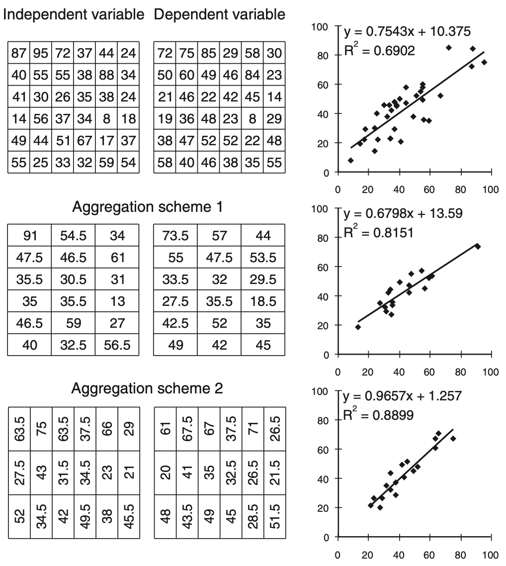
We’re still in Chapter 2, where on pages 36-39, the modifiable areal unit problem (MAUP) is introduced. The MAUP is the big bad of spatial analysis. The MAUP is to spatial analysis as the Mindflayer1 is to Stranger Things. There’s a simple illustration of the MAUP in Figure 2.1 of the book:
I’ve replicated this kind of thing elsewhere, in Computing Geographically, Chapter 5.2 This post uses the automated zoning azp function in Kyle Walker‘s recently released spopt package to enable more ’realistic’ aggregations of some gridded datasets. The same technique could be applied to census small areas to generate alternative aggregations to large area units. In fact, originally I did exactly that. In the end, however, I wanted to explore how different initial statistical properties in data interact with aggregation, and real census data didn’t give me any control over that.
As usual, we need a bunch of libraries.
library(dplyr)
library(tidyr)
library(sf)
library(terra)
library(gstat)
library(sfdep)
library(spopt)
library(ggplot2)
library(cols4all)
library(patchwork)spoptI was excited when spopt appeared in my LinkedIn feed a month or so ago just as I was thinking about putting a post on MAUP together.
Here’s what we can do with it. First, make a simple grid, and add to it some variables.
xy <- expand_grid(x = 1:8, y = 1:8) |>
  mutate(
    column = x,
    row = y,
    rnd = runif(n())) |>
  rast(type = "xyz", crs = "+proj=eqc") |>
  as.polygons(aggregate = FALSE) |>
  st_as_sf()

plot(xy)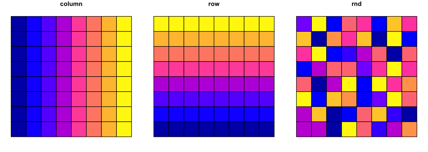
And now we can zone it using spopt::azp. This is well explained at the package website here. We’re not using it here in a highly sophisticated way, the important thing is that we can do this at all. The key parameters passed to azp are the list of attributes (attrs) to use in identifying similar areas to combine, and the number of regions required (n_regions).
Here’s an example, regionalised based on similarity in the column attribute.
xy |>
  azp(attrs = c("column"),
      n_regions = 8,
      weights = "rook",
      method = "basic") |>
  ggplot() +
    geom_sf(aes(fill = .region)) +
    scale_fill_brewer(palette = "Set2") +
    guides(fill = "none") +
    theme_void()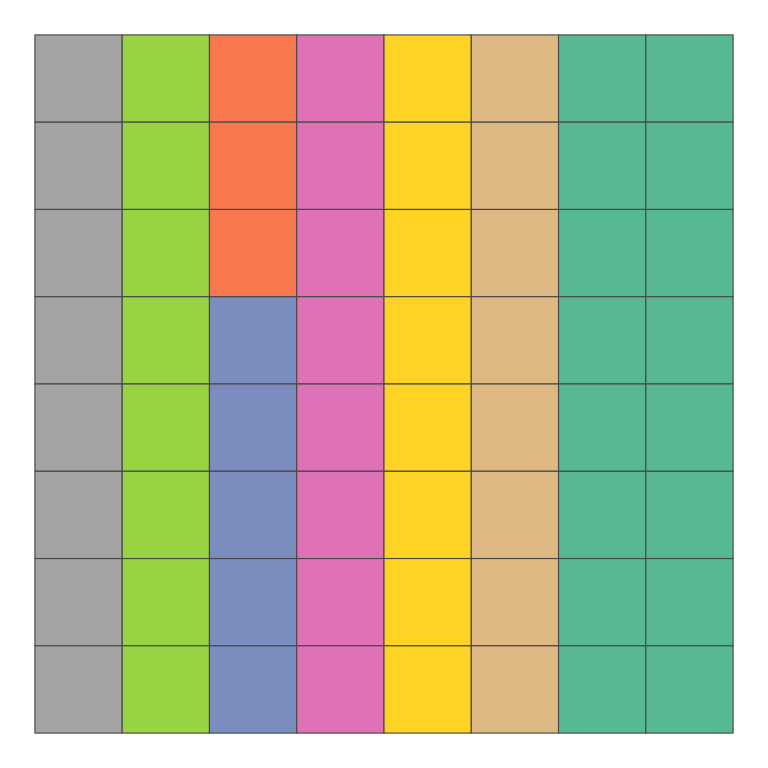
column attribute. Note that due to variability in the procedure, the regionalisation does not precisely respect values of the attribute.
It is important to note here that azp is non-deterministic, and as a result it doesn’t regionalise perfectly. In a situation like this if I wanted to regionalise based on columns, I would simply use group_by(column). That’s not what azp is for: rather, it finds regions by looking for more or less homogeneous sets of areas, which it tags with a .region identifier, which can subsequently be used to aggregate areas into larger areas.
The real virtue of this is we can request regionalisation based on any attributes. For example, if we don’t provide any attributes, it regionalises based on similarity across all attributes, which in this case, since there’s a random attribute in there will give us random shapes.
xy |>
  azp(n_regions = 8,
      weights = "rook",
      method = "basic") |>
  ggplot() +
    geom_sf(aes(fill = .region)) +
    scale_fill_brewer(palette = "Set2") +
    guides(fill = "none") +
    theme_void()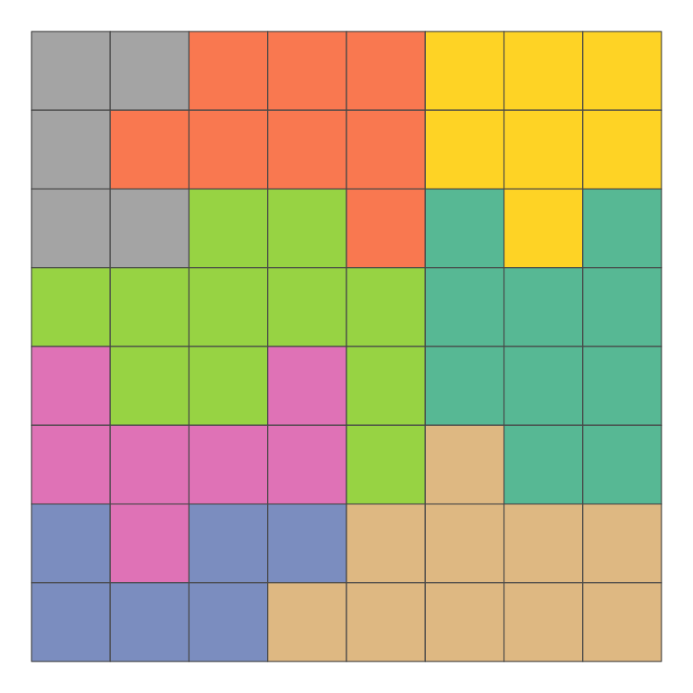
Of course, azp can handle much larger datasets than these 8×8 grids. In what follows we work with 1024 cell 32×32 grids.
azp to make regionalisationsIt’s convenient to wrap azp in a function that assigns a random variable and regionalises the input data on that.
random_regionalisation <- function(areas, n) {
  areas |>
    mutate(x = rnorm(n())) |>
    azp(attrs = c("x"),
        n_regions = n,
        weights = "rook",
        method = "basic") |>
    select(-x)
}
Below we use this function to generate a random regionalisation.
set.seed(1)

rr <- expand_grid(x = 1:32, y = 1:32) |>
  mutate(z = runif(n())) |>
  rast(type = "xyz", crs = "+proj=eqc") |>
  as.polygons(aggregate = FALSE) |>
  st_as_sf() |>
  random_regionalisation(32) |>
  mutate(.region = as.integer(.region))

ggplot(rr) +
  geom_sf(aes(fill = .region), colour = NA) +
  scale_fill_continuous_c4a_seq("tableau.20") +
  geom_sf(data = rr |> group_by(.region) |> summarise(),
          fill = NA, colour = "white") +
  guides(fill = "none") +
  theme_void()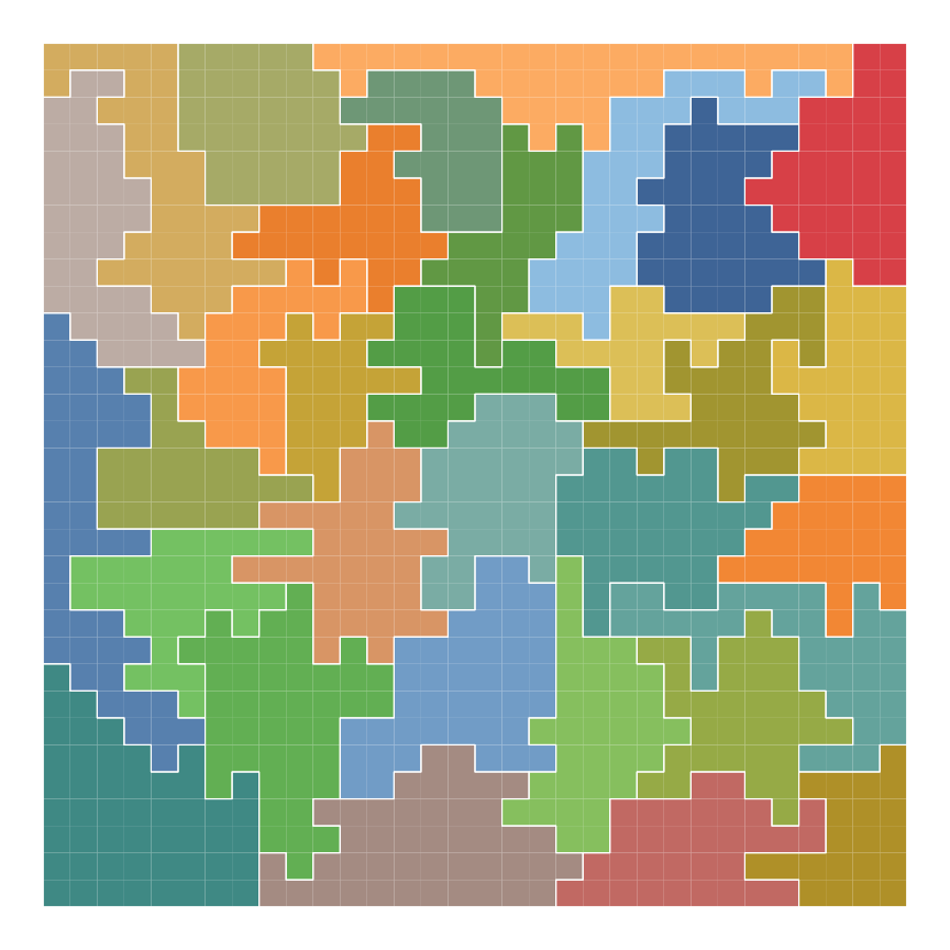
Once we’ve added a region attribute to a grid, we’ll want to use that attribute to create new polygons, using group_by().
dissolve <- function(df, group_var, vars, fn = mean) {
  df |>
    group_by({{ group_var }}) |>
    summarise(across({{ vars }}, ~ fn(., na.rm = TRUE)))
}
I’ve set dissolve() up to summarise a supplied list of variables (vars) using the mean function.
Here I’ve used a method described in this post by G. T. Antell.
get_xyz_surfaces <- function(n = 1, width = 32, height = 32, range = 5) {
  xy <- expand_grid(x = 1:width, y = 1:height)
  g <- gstat(formula = z ~ 1,
             locations = ~ x + y,
             dummy = TRUE,
             beta = 10,
             model = vgm(psill = 0.1, range = range, model='Exp'),
             nmax = 20)
  predict(g, newdata = xy, nsim = n) |>
    rast(type = "xyz", crs = "+proj=eqc") |>
    as.polygons(aggregate = FALSE) |>
    st_as_sf()
}
The critical parameter passed to get_xyz_surfaces() is range which specifies the scale in grid squares over which data values are correlated.
grids <-
  mapply(get_xyz_surfaces, range = c(0.1, 2, 10), SIMPLIFY = FALSE)
[using unconditional Gaussian simulation]
[using unconditional Gaussian simulation]
[using unconditional Gaussian simulation]g1 <- ggplot(grids[[1]]) +
geom_sf(aes(fill = sim1)) +
scale_fill_viridis_c(option = "D") +
guides(fill = "none") +
ggtitle("Range 0.1") +
theme_void()
g2 <- ggplot(grids[[2]]) +
geom_sf(aes(fill = sim1)) +
scale_fill_viridis_c(option = "D") +
guides(fill = "none") +
ggtitle("Range 2") +
theme_void()
g3 <- ggplot(grids[[3]]) +
geom_sf(aes(fill = sim1)) +
scale_fill_viridis_c(option = "D") +
guides(fill = "none") +
ggtitle("Range 10") +
theme_void()
g1 | g2 | g3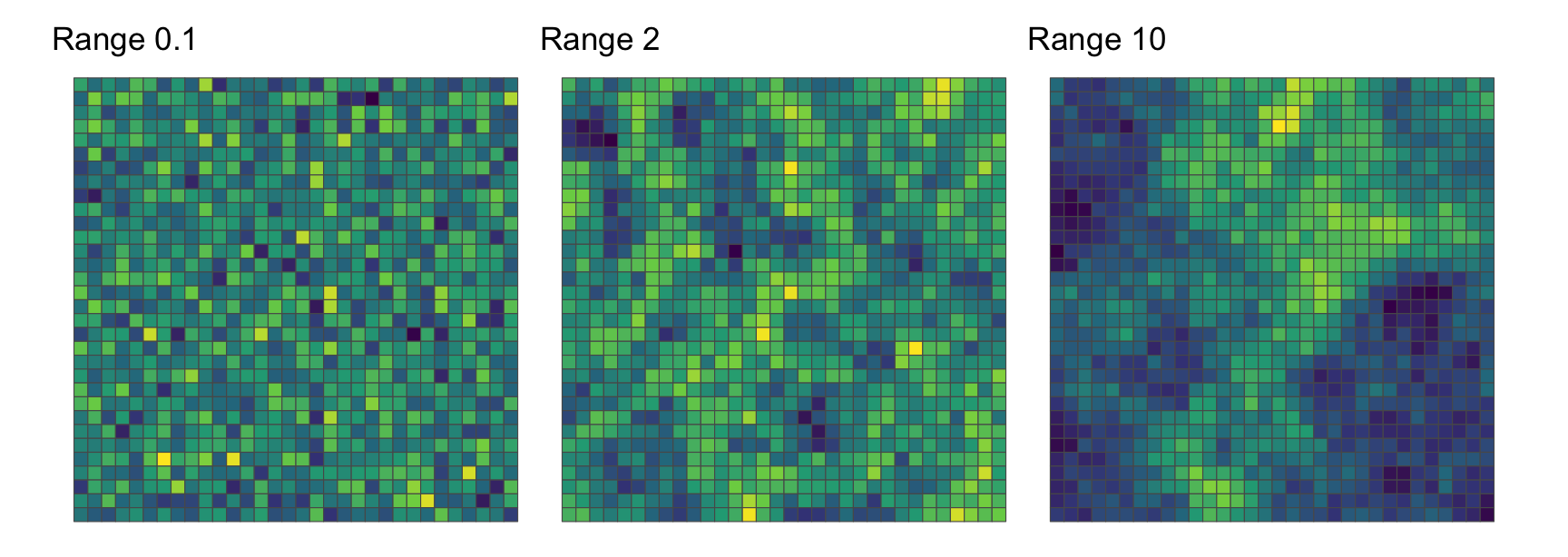
We can confirm the visual impression of increasing positive spatial autocorrelation as the range increases using Moran’s index.
nb <- st_contiguity(grids[[1]], queen = FALSE)
wt <- st_weights(nb)
global_moran_test(grids[[1]]$sim1, nb, wt)$estimate[1]
Moran I statistic
-0.02312733 global_moran_test(grids[[2]]$sim1, nb, wt)$estimate[1]Moran I statistic
0.5206069 global_moran_test(grids[[3]]$sim1, nb, wt)$estimate[1]Moran I statistic
0.8427075 We can now get to the point.
The classic statistic affected by aggregation noted in the earliest writing on the MAUP3 is the correlation coefficient between variables.
A function to calculate correlations among bunch of variables called sim* is shown below. We need the correlations as simple vector of values, not the matrix of all pairwise combinations of variables, the required pairs are passed as a two column matrix.
get_correlations <- function(g, ij_pairs) {
  (g |>
     select(starts_with("sim")) |>
     st_drop_geometry() |>
     cor())[ij_pairs]
}Finally, we can make a dataframe of ‘before and after’ correlations among 50 spatial data sets. To begin, we use the single regionalisation from earlier in all cases. We apply this regionalisation to sets of 50 simulated grids, each sharing the range parameter, so that they are all realisations of the same statistical spatial process.
nsim <- 50
ij <- combn(1:nsim, 2) |> t()
ij_df <- ij |>
  data.frame() |>
  rename(i = X1, j = X2)
ranges <- c(0.1, 1, 2, 5, 10, 20)

dfs <- list()
grid_list <- list()
for (range in ranges) {
  grid <- get_xyz_surfaces(n = nsim, range = range) |>
    mutate(region = rr$.region)
  grid_list[[as.character(range)]] <- grid
  grid32 <- grid |>
    dissolve(group_var = region, vars = starts_with("sim"), mean)
  dfs[[length(dfs) + 1]] <-
    ij_df |>
    mutate(c0 = grid   |> get_correlations(ij),
           c1 = grid32 |> get_correlations(ij),
           range = range)
}
df_by_range <- bind_rows(dfs)
We expect the sets of 50 surfaces to exhibit a range of correlations with one another, for the most part weak correlations, but with the longer range, more autocorrelated simulations more likely to yield some strong corrrelations with one another if overall trends in two surfaces happen to be somewhat aligned. We can see this by picking out the most negatively and most positively correlated pairs of grids.
df_by_range |>
  arrange(c0) |>
  slice(1, n())
i j c0 c1 range
1 23 24 -0.7190956 -0.8692254 20
2 24 46 0.7686680 0.8844341 20Interestingly sim24 of the range 20 grids is involved in both pairs, and we can see why this is below, where very distinctive and large scale spatial structure of that grid (in the middle) happens to align with the grid on its right and ‘counter-align’ with the grid on its left.
ggplot(grid_list[["20"]]) +
  geom_sf(aes(fill = sim23)) +
  scale_fill_viridis_c(option = "D") +
  guides(fill = "none") +
  ggtitle("range=20 sim23") +
  theme_void() |
ggplot(grid_list[["20"]]) +
  geom_sf(aes(fill = sim24)) +
  scale_fill_viridis_c(option = "D") +
  guides(fill = "none") +
  ggtitle("range=20 sim24") +
  theme_void() |
ggplot(grid_list[["20"]]) +
  geom_sf(aes(fill = sim46)) +
  scale_fill_viridis_c(option = "D") +
  guides(fill = "none") +
  ggtitle("range=20 sim46") +
  theme_void()
And here’s how the correlations among 50 sets of data change when the 32×32 grids are aggregated to 32 areas.
ggplot(df_by_range, aes(x = c0, y = c1)) +
  geom_hex(binwidth = 0.08) +
  scale_fill_distiller(palette = "Reds", direction = 1) +
  # geom_abline(intercept = 0, slope = 1, lty = "dashed") +
  # geom_smooth(colour = "black", linewidth = 0.5, fill = NA) +
  coord_equal() +
  xlab("Initial correlation") +
  ylab("Aggregated correlation") +
  guides(fill = "none") +
  facet_wrap( ~ range, labeller = "label_both") +
  theme_minimal() +
  theme(panel.border = element_rect(fill = NA, colour = "darkgrey"))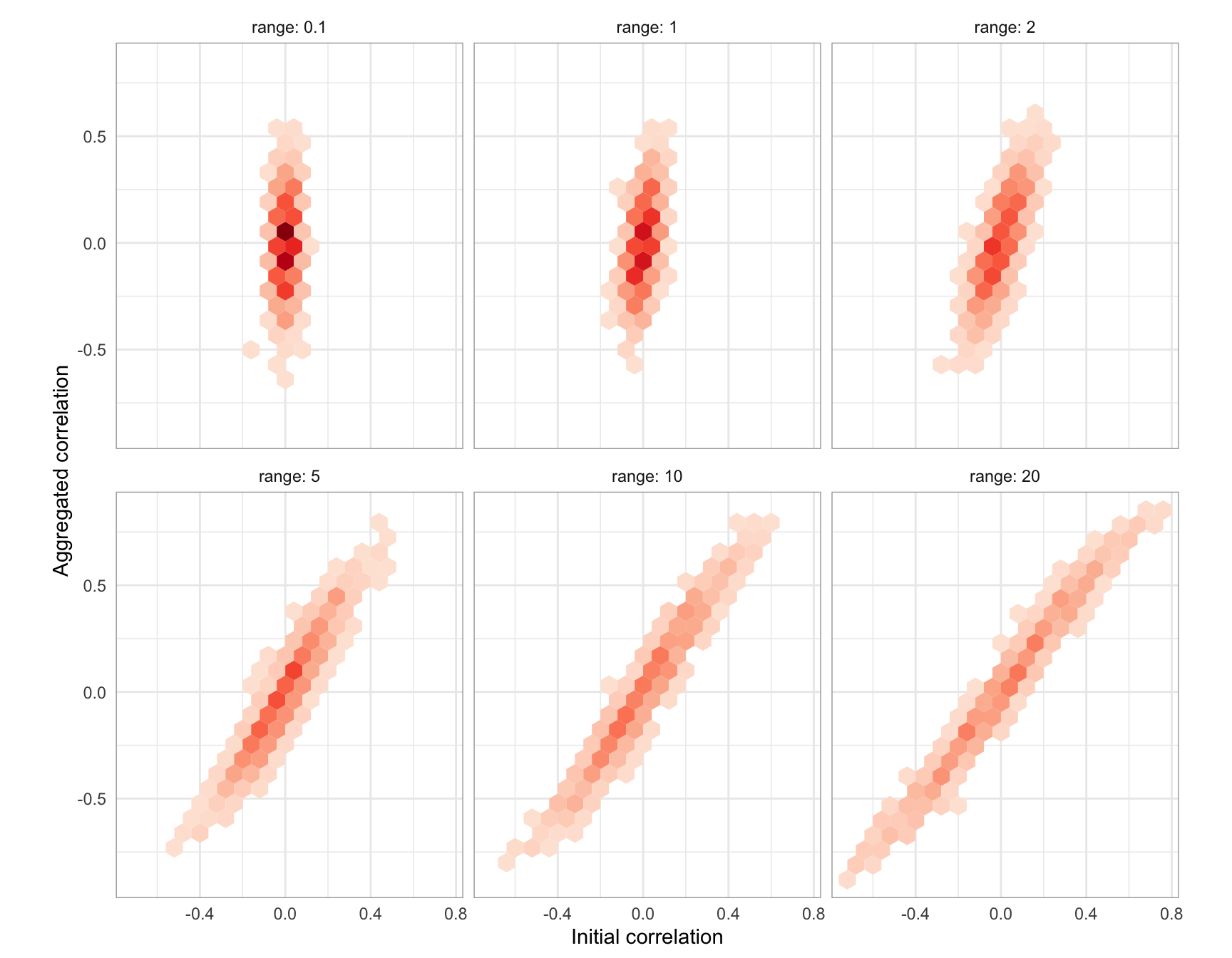
The striking thing about this result is that low range cases, where correlations among the grid variables before regionalisation are low, can see large increases in their correlations after aggregation. In some cases, initially uncorrelated data may end up with correlations as large as ±0.5.
Focusing on this is not to downplay the changes in correlation that arise for initially more correlated pairs of inputs, where a correlation of 0.4 might increase to 0.5 or more. However, it does suggest that perhaps quite strongly correlated variables are fairly robust to aggregation effects. This might be a source of optimism: perhaps the MAUP is not really a problem in the presence of strong correlations in disaggregate data.
The problem with this perspective is that observing a correlation of (say) 0.5 in aggregated data doesn’t tell us very much about how strong the correlation might be in the more disaggregate underlying data. Based on the admittedly one-off result above, a post-aggregation correlation (c1) between two attributes in the range 0.475 to 0.525 might arise from disaggregate data with a correlation (c0) between those attributes anywhere between -0.031 and 0.466:
df_by_range |>
  filter(c1 > 0.475, c1 <= 0.525) |>
  pull(c0) |>
  summary()
Min. 1st Qu. Median Mean 3rd Qu. Max.
-0.03092 0.22746 0.31268 0.28083 0.35930 0.46618 We can be fairly certain that the correlation of the disaggregate data is lower than it is after aggregation, but we don’t really know how much lower.
So much for the aggregation effect of the MAUP. What about the zoning effect?
To explore this we can apply 50 different regionalisations to the data and see if we can make any sense of the results. I made these previously using the random_regionalisation() function, so we read them in from a file.4
dfs <- list()
regionalisations <- read.csv("regionalisations.csv")
grid32_list <- list()
for (regions in names(regionalisations)) {
grid <- grid_list[["5"]] |>
mutate(region = regionalisations[, regions])
grid32 <- grid |>
dissolve(group_var = region, vars = starts_with("sim"), mean)
grid32_list[[length(grid32_list) + 1]] <- grid32
dfs[[length(dfs) + 1]] <-
ij_df |>
mutate(c0 = grid |> get_correlations(ij),
c1 = grid32 |> get_correlations(ij),
regions = regions)
}
df_by_regions <- bind_rows(dfs) |>
mutate(x = runif(n())) |>
arrange(x) |>
select(-x)It’s useful here to look at some of the alternative regionalisations, just to get a feel for how differently the maps come out. Below are 24 of the regionalisations with one of the attributes (sim1) mapped.
simple_map <- function(gdf) {
  ggplot(gdf) +
    geom_sf(aes(fill = sim1), colour = NA) +
    scale_fill_distiller(palette = "Reds", direction = 1) +
    guides(fill = "none") +
    theme_void()
}
grid32_list[1:24] |> lapply(simple_map) |> wrap_plots(ncol = 6)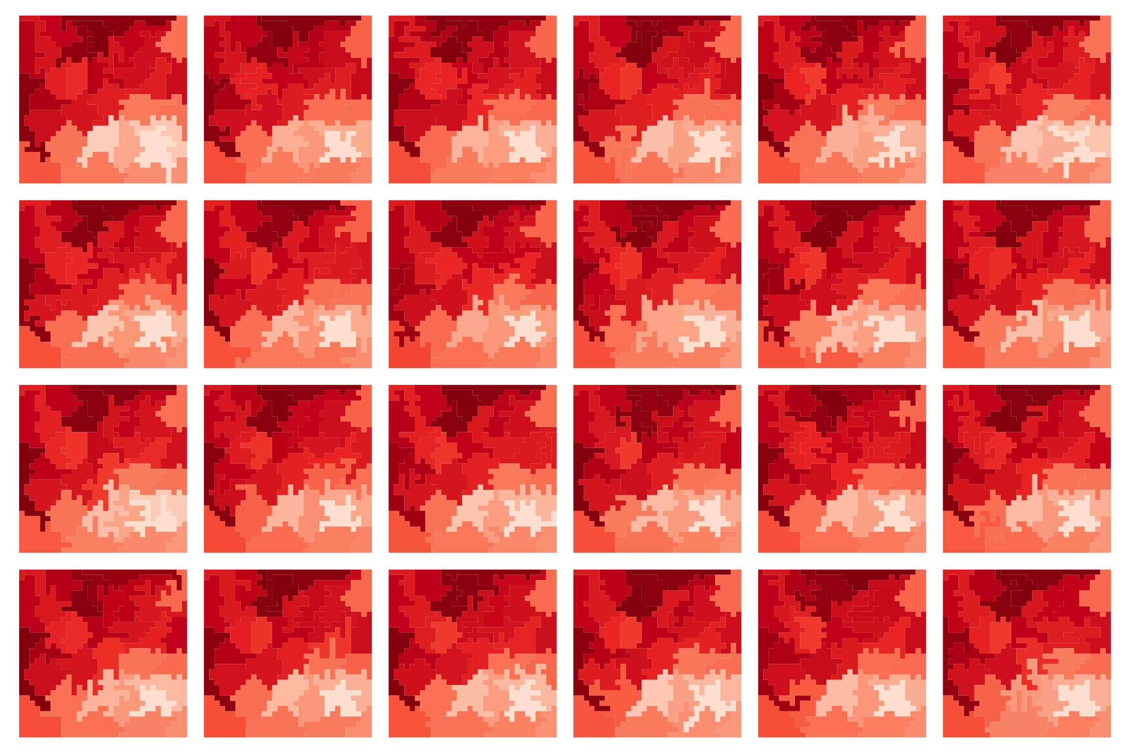
sim1 for 24 of the 50 alternate regionalisations.
It’s worth holding on to the fact that these maps don’t seem that different from one another!
We have 50 different regionalisations. This may be too many to present in a series of 50 facets, although that’s no reason not to give it a try. I’ve removed the axes labels and scales so that each hexbin plot is in effect a ‘glyph’.
ggplot(df_by_regions, aes(x = c0, y = c1)) +
  geom_hex(binwidth = 0.08) +
  scale_fill_distiller(palette = "Reds", direction = 1) +
  coord_equal() +
  guides(colour = "none", fill = "none") +
  facet_wrap( ~ regions, ncol = 10) +
  theme_void()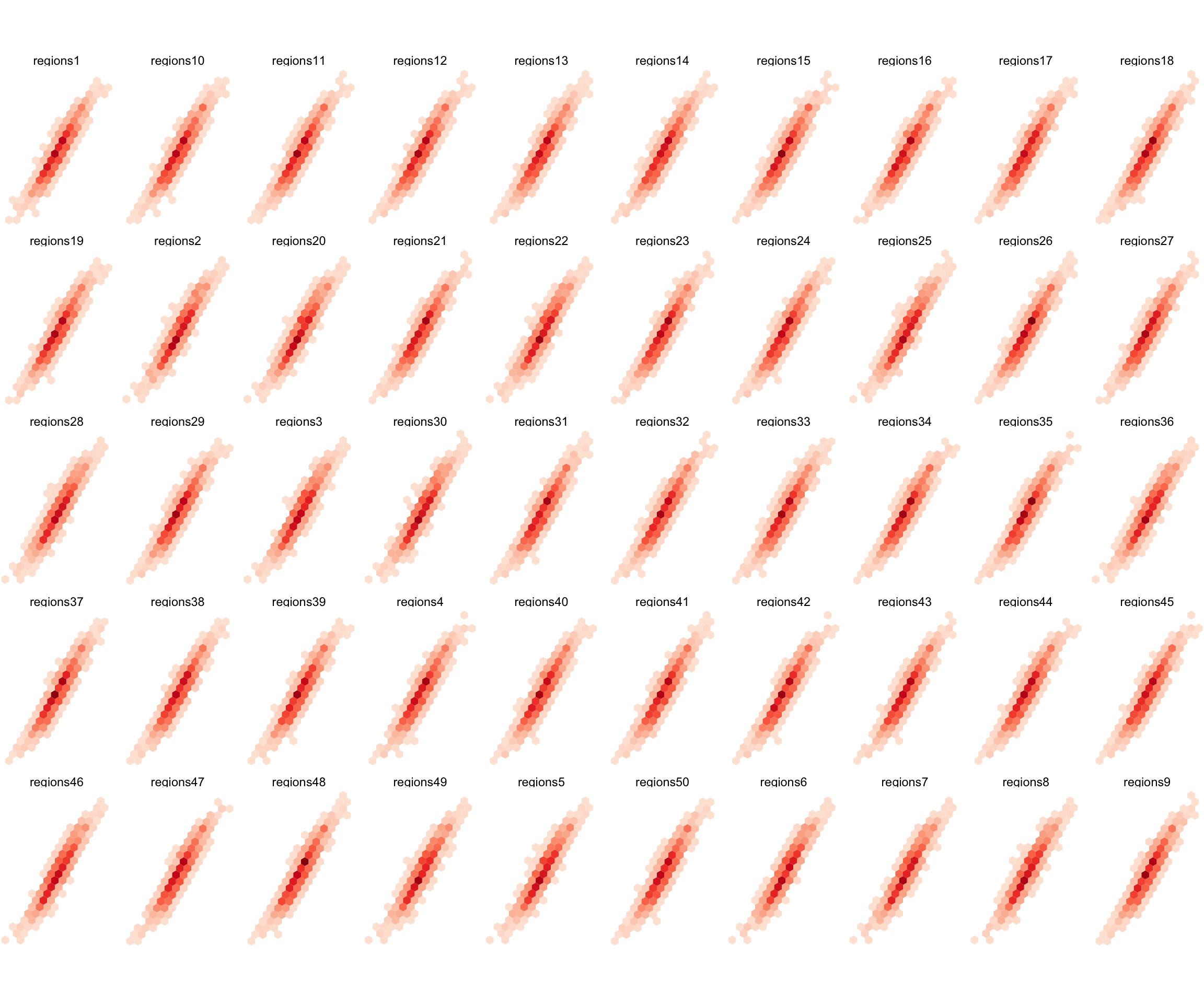
While not readable in any detail, this plot graphically makes the point that it doesn’t much matter which regionalisation we use, the impact on correlations is the same.
A potentially more informative plot shows, for each of the 1225 starting correlations among our 50 spatial patterns, a line extending from the lowest to the highest correlation after aggregation. The extent of the lines shows the variation in the outcome correlations across 50 different regionalisations.
df_by_regions_summary <-
  df_by_regions |>
  group_by(i, j) |>
  summarise(c0 = mean(c0),
            mean_c1 = mean(c1),
            min_c1 = min(c1),
            max_c1 = max(c1),
range_c1 = max_c1 - min_c1) ggplot(df_by_regions_summary) +
geom_linerange(aes(x = c0, ymin = min_c1, ymax = max_c1),
colour = "black", alpha = 0.2) +
geom_point(aes(x = c0, y = mean_c1), size = 0.35) +
xlab("Initial correlation") +
ylab("Aggregated correlation") +
theme_minimal()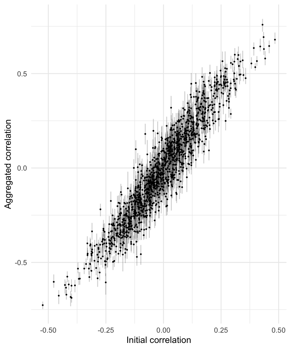
This plot seems to confirm that the variability in correlations across different regionalisations (the zoning effect) is greater when the correlation of the disaggregate data is weaker. We can confirm this observation by plotting the range in correlations after aggregation against initial correlations.
ggplot(df_by_regions_summary, aes(x = c0, y = range_c1)) +
  geom_point(alpha = 0.5) +
  # geom_smooth(method = "gam") +
  xlab("Initial correlation") +
  ylab("Range of aggregated correlations") +
  theme_minimal()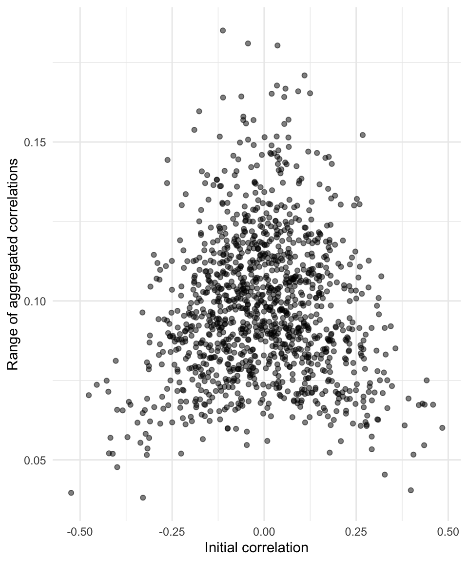
As before the cause for real concern is when the underlying disaggregate data are not very correlated at all.
At any rate, it’s a problem if you are working with aggregated data.5
A couple of thoughts here:
First, spatially aggregating data is really not that different than time series averaging or smoothing. Time series are routinely smoothed by averaging, a process completely analogous to aggregating spatial data to zones. The analogy is stronger still if we aggregate spatial data to grids, which is becoming increasingly common for demographic data. Smoothing of time series is often carried out so we can see trends against background noise. From this perspective, aggregating data spatially can be understood as a way to make it easier to see patterns.
The world is overwhelming complicated and it’s nice to be able to make sense of it a little more easily. The danger is in starting to believe that the aggregates are real things: the point of the MAUP is, that yes, aggregation has effects on statistical summaries, but perhaps more importantly that those effects are modifiable. Different zones, different patterns, even if as Figure 9 suggests similar patterns will still show through across many alternative zoning schemes.
Second, maybe the MAUP is becoming less of a problem as progressively more and more detailed and disaggregate data are more routinely used. On the one hand, I don’t find this argument particularly convincing. Yes “we’re all individuals”6 but that’s not really how we interact with or are managed by government agencies. It might be how we interact with our digital overlords, or more accurately, how they sell our eyeballs to advertisers, but for the time being it seems very likely that in many contexts, for many purposes spatially aggregated data will remain analytically important.
On the other hand, far be it from me to be optimistic about machine-learning and AI, but these tools do seem to hold out a hope of developing different tailored zoning schemes in different contexts for different purposes. A team of social scientists looking at education through the lens of income might work with a different set of spatial aggregations than another team researching housing effects on health.
In sum, the MAUP really becomes a serious problem if we insist on not modifying the area units we use, because one set of area units can only be the ‘right’ set for a limited subset of all the things you might want to do with such data. Other than when we want to apply the same regionalisations over time for longitudinal study, we should lean into bespoke zoning systems tailored to different uses. I’m not sure I’d call that “a new geographical revolution” as Stan Openshaw did,7 it’s more a pragmatic response to the nature of spatial data.
Either way, in light of all of the above, we’d best keep the MAUP firmly in mind for a long time to come.
![]()
Or is it Vecna, or is it… oh, never mind↩︎
Gehlke CE and K Biehl. 1934. Certain effects of grouping upon the size of the correlation coefficient in census tract material. Journal of the American Statistical Association 29(185) 169–170.↩︎
This just makes it a bit easier to manage variability from run to run as I edit and re-edit this post…↩︎
And we haven’t even looked into whether constructing zones for homogeneity on one variable affects outcomes for other variables more or less than these random zonings…↩︎
Hat tip to The Life of Brian.↩︎
Page 38 in Openshaw S. 1983. The Modifiable Areal Unit Problem. Concepts and Techniques in Modern Geography 38 Norwich, England: Geo Books. Available at http://www.qmrg.org.uk/catmog.↩︎