Code
library(sf)
library(colorspace)
library(leaflet)
library(leaflet.extras)
library(dplyr)
library(stringr)Wellington’s weather is famously (in New Zealand) a bit of a joke. It’s true that you can’t beat Wellington on a good day,1 but… it’s not very often a good day. Or so the story goes. Being from Ireland, I’ve never really considered Wellington’s weather to be especially bad. Sure, it’s generally cooler than much of New Zealand, and much much windier,2 but overall it’s fine.
However, it’s been a rough week or two of extreme weather in Aotearoa New Zealand in general and in the last week in the Wellington region in particular. Recent reports suggest that New Zealand now has a cyclone season, and storm frequency has increased to one every eight days.
Meanwhile, life goes on, and we’ve been in the process of buying a house, or more accurately, trying to… As a result I’ve looked at more than a few flood risk maps using the Wellington City Property map over the last several months. Familiarity with that resource got me wondering, on the morning after the storm, as I made the usually 12 minute trip from our rental in Island Bay up to the house we just sold in Brooklyn (taking 40 flood-disrupted minutes to do so), how informative those flood maps were with respect to recent events.
The striking thing about this particular weather ‘event’ was just how intensely localised it was. Almost all the news reports focused on a fairly small area of Wellington’s southern suburbs. Obviously, there was a lot of rain and (I assume) flooding elsewhere, but the really catastrophic stuff was in Brooklyn, Island Bay, and Newtown. Long story short, what we need is a map.
library(sf)
library(colorspace)
library(leaflet)
library(leaflet.extras)
library(dplyr)
library(stringr)I pulled some flood risk data layers from Wellington’s open data portal. Slightly perplexingly these come in three separate layers of inundation area, overland flowpath, and stream corridor, which are designated as low, medium, and high hazard respectively. I’m not entirely sure what relationship these layers have to the flood modelling layers that appear in Land Information Memoranda (LIM) reports, which show inundation depths (and can run to over a metre).
The low-medium-high hazard designation seems to be premised mostly on the likely speed with which hazardous flooding might arise, since the high hazard areas are a 5m buffer around open streams, medium hazard represents “the predicted path of stormwater as it flows over topography”, and the low hazard areas seem more associated with ponding, i.e., where water will end up ‘sitting’ as it eventually drains. Saying that, I’m pretty sure that parts of the ‘low hazard’ inundation zones would be very hazardous indeed to be anywhere near at the wrong time, given some of the predicted depths on the property maps.
Anyway, the data I’m using has been further simplified (using rmapshaper) because the source data are very large and resulted in an unwieldy web map. So, the disclaimers that Wellington Water allow themselves in relation to these data,3 apply with even greater force to the map below.
I also assign a set of blue colours to the different hazard levels, and include these as a fill attribute in the data. This makes life easier using leaflet later.
blues <- data.frame(
hazard = c("Low", "Medium", "High"),
fill = "dodgerblue4" |> lighten(2:0 / 4)
)
flood_hazard <- st_read("flood-risk-simplified.gpkg") |>
left_join(blues)I also grabbed a screenshot to get some idea of the rainfall. This is from an interesting piece by James Renwick about the wild unpredictabily and ferocity of this storm (almost 80mm of rain fell in an hour in some areas early on Monday morning).
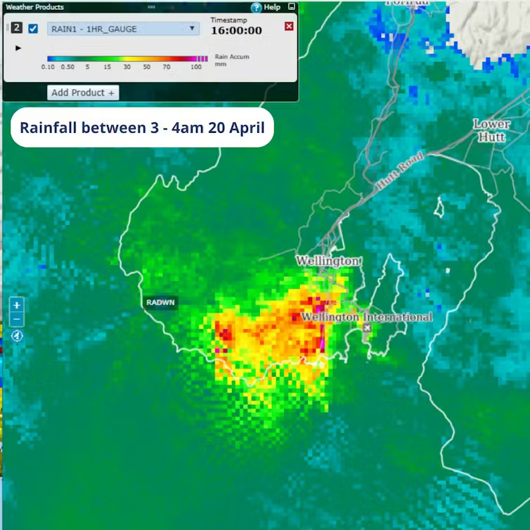
I roughly georeferenced this so it could be included in the map. Not entirely satisfactory, but getting data out of Metservice is not for the faint-hearted, and this image serves my purpose well.
rain <- terra::rast("rainfall-3-4am.tif")Finally, I trawled news reports from the last few days for pictures of the flooding and then spent an inordinate amount of time geolocating them on StreetView. Maybe I could have asked an AI, but then again, I’d probably have had to spend just as long checking their work if I had done.
I’m reasonably familiar with the affected areas, and Wellington’s housing stock is so mixed that it’s not hard to spot something distinctive in any given picture as a reference point. The biggest challenge was that many of the pictures were taken before daylight, so the cues for matching them to the StreetView imagery weren’t necessarily clearly visible. Also… there’s an awful lot of water in the pictures in places where it shouldn’t be. I also downloaded the associated pictures locally so I could easily link them to the map.
reports <- read.csv("reports.csv") |>
# st_as_sf(coords = c("lon", "lat"), crs = 4326) |>
mutate(
link = str_glue("<a href='{story}'>Go to story</a>"),
image_html = str_glue("<img src='images/{image}' width='300px'>"),
popup = str_glue("<p><b>{description}</b> {link}</p>{image_html}<p>Image credit: {image_credit}</p>")
)So, here’s the map. I found tmap’s web map options a bit inflexible in this case, so instead have used leaflet the accurately, but confusingly and tautologously named R package for driving leaflet the Javascript library for making web maps.
leaflet(options = leafletOptions(zoomControl = FALSE)) %>%
htmlwidgets::onRender("function(el, x) {
L.control.zoom({ position: 'topright' }).addTo(this)
}") |>
addTiles() |>
addPolygons(
data = flood_hazard |> st_transform(4326),
fill = TRUE, fillColor = ~fill, fillOpacity = 0.8,
stroke = FALSE, group = "Flood hazard"
) |>
addRasterImage(rain, group = "Rainfall") |>
addCircleMarkers(
data = reports,
lng = ~lon, lat = ~lat, popup = ~popup,
color = "red", group = "Stories"
) |>
addLayersControl(
overlayGroups = c("Flood hazard", "Rainfall", "Stories"),
position = "topleft"
) |>
addLegend(
data = blues,
title = "Flood hazard",
position = "topleft",
colors = ~fill, labels = ~hazard,
opacity = 0.8
) |>
addFullscreenControl(
position = "bottomright",
pseudoFullscreen = FALSE
) |>
hideGroup("Rainfall")