Code
library(dplyr)
library(sf)
library(ggplot2)
library(patchwork)After a bit of a break, it seems like a good time to get back to supporting material for Geographic Information Analysis. Before I do that, you might want to check out the index to all these posts, where I’ve compiled an index for the entries so far1.
OK… welcome back. In this post, I am moving on to Chapter 4 Maps as outcomes of processes. I’ll get to point patterns in later posts, but first I want to jump straight to recreating Figure 4.6 which shows the theoretical and empirical probability density functions for the lengths of lines across a rectangular space. Mostly I’m jumping ahead to this topic because it was more interesting to code than point processes, which are so ably handled by built-in functions in spatstat.
library(dplyr)
library(sf)
library(ggplot2)
library(patchwork)The setup here is to ask what is the expected distance between the entry and exit points of lines crossing a rectangle or some other shape—although we’ll stick to rectangles in this section. This seems rather artifical, although the key paper on the topic begs to differ:
There are several practical situations where one requires the statistical properties of the straight path length l across a specified geometrical shape. Typical examples are the length of the path of a gamma-ray to the wall of a nuclear reactor (Primak 1956), the length of a sound ray in a room from one reflection to the next (Kosten 1960), or the length of a straight path across a square (Horowitz 1964).2
In any case, it’s an interesting little puzzle. Horowitz shows that for a rectangular region of width \(W\) and height \(H\), where \(W>H\), the probability density function for path lengths is given as follows. If the length is less than \(H\)
\[ p(l)= \frac{4}{\pi(W+H)} \]
For lengths between \(W\) and \(H\)
\[ p(l) = \frac{2}{\pi(W+H)}\left[\frac{WH}{l\sqrt{l^2-H^2}}-\frac{\sqrt{l^2-H^2}}{l} +1\right] \]
And for lengths between \(W\) and the maximum possible length \(\sqrt(H^2+W^2)\)
\[ p(l) = \frac{2}{\pi(W+H)}\left(\left[\frac{WH}{l\sqrt{l^2-H^2}}-\frac{\sqrt{l^2-H^2}}{l}\right] + \left[\frac{WH}{l\sqrt{l^2-W^2}}-\frac{\sqrt{l^2-W^2}}{l}\right]\right) \]
We can implement a function to return this value for a given length and width and height of a space. I’ve tidied up Horowitz’s factorisation of the calculations a bit, which is why the calculations in the code look a bit different than they do in the above equations.
get_horowitz_probability <- function(L, W, H) {
  h <- min(c(W, H))
  w <- max(c(W, H))
  k <- 2 / pi / (w + h)
  if (L < h) {
    return (2 * k)
  } else {
    a <- w * h
    y <- sqrt(L ^ 2 - h ^ 2)
    if (L < w) {
      return (k * (a - y ^ 2 + L * y) / L / y)
    } else {
      z <- sqrt(L ^ 2 - w ^ 2)
      return (k * ((a - y ^ 2) / L / y +
                   (a - z ^ 2) / L / z))
    }
  }
  return (0)
}
We’ll use this a bit later on. Meanwhile, since we’re going to be drawing lines across a rectangle, it’s convenient to have a function for making a rectangle shape.
get_rectangle <- function(xmax = 1, ymax = 1) {
 st_linestring(matrix(c(0, 0, xmax, xmax, 0,
                        0, ymax, ymax, 0, 0), ncol = 2)) |>
  st_sfc()
}
Next, we empirically draw a large number of lines between two points chosen at random on the perimeter of a rectangle. We’ll make a rectangle with 3:4 width-to-height ratio, and draw 2500 randomly generated lines.
n <- 2500
W <- 3/5
H <- 4/5
max_d <- sqrt(W ^ 2 + H ^ 2)
rect <- get_rectangle(xmax = W, ymax = H)
A ‘GIS-y’ way to draw the lines it to pick two random points along the perimeter of the rectangle and connect them.3 The code below implements this using a function to take a list of points (an even number of them) and convert it into half that number of lines with consecutive points from the list as their ends. We do it this way as a generalisation to be reused later.
get_lines_from_points <- function(xys) {
  xys |>
    unlist() |>
    matrix(ncol = 4, byrow = TRUE) |>
    apply(1, \(x) matrix(x, ncol = 2, byrow = TRUE),
          simplify = FALSE) |>
    lapply(st_linestring) |>
    st_sfc() |>
    data.frame() |>
    st_sf() |>
    mutate(length = st_length(geometry))
}

lines <- runif(2 * n) |>
  st_line_interpolate(line = rect, normalized = TRUE) |>
  get_lines_from_points()
Next, make a dataframe with the theoretical probability density function.
prob <- data.frame(
  d = 0:500 / 500 * max_d,
  p = mapply(get_horowitz_probability, 0:500 / 500 * max_d,
             W = W, H = H)
)
And finally we can plot all this, rescaling the histogram of the empirical data to match the theoretical probability density.
g1 <- ggplot() +
  geom_sf(data = rect, fill = NA) +
  geom_sf(data = lines, lwd = 0.03) +
  theme_void()

g2 <- ggplot(lines) +
  geom_histogram(
    aes(x = length, y = after_stat(count / sum(count) * 50 / max_d)),
    fill = "lightgrey", colour = "white", lwd = 0.1, bins = 50) +
  geom_line(data = prob, aes(x = d, y = p)) +
  xlab("Length") +
  ylab("Probability density") +
  theme_minimal()

g1 | g2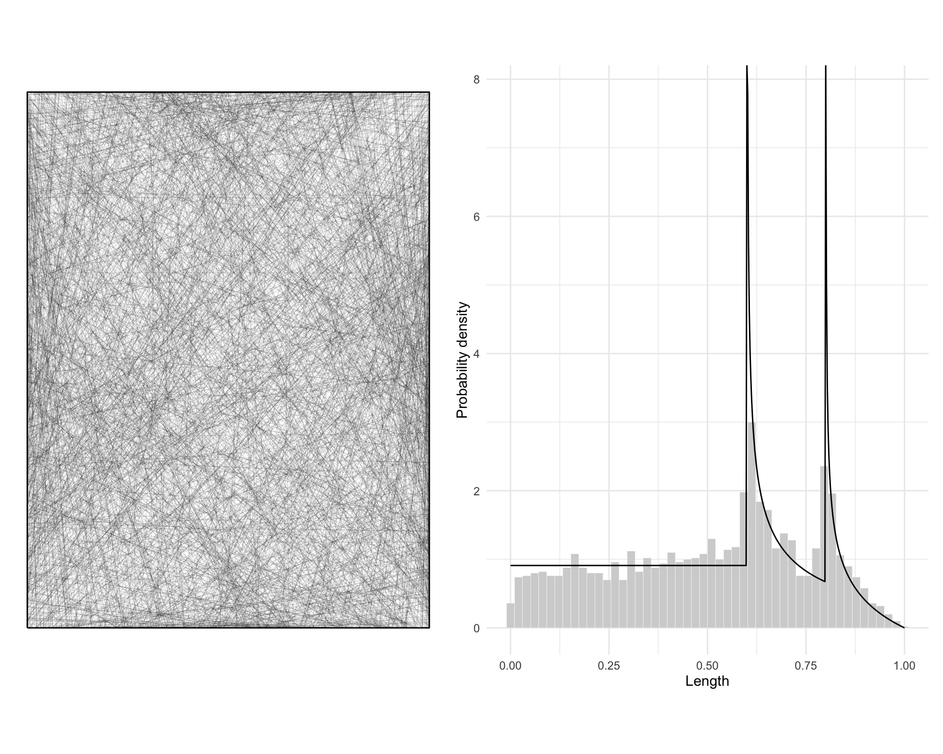
A minor issue with this is that nothing in the line generation code prevents a line entering and exiting the space along the same side of the rectangle. We can see this if we tag each line with a flag indicating if it’s one of those ‘same side’ lines or not.
lines <- lines |>
  bind_cols(lines$geometry |> sapply(st_bbox) |> t()) |>
  mutate(`Same side` = xmin == xmax | ymin == ymax)

g3 <- ggplot(lines) +
  geom_sf(aes(colour = `Same side`),  lwd = 0.03) +
  scale_colour_brewer(palette = "Set1") +
  guides(colour = "none") +
  theme_void()

g4 <- ggplot(lines) +
  geom_histogram(
    aes(x = length, y = after_stat(count / sum(count) * 50 / max_d),
        group = `Same side`, fill = `Same side`),
    colour = "white", lwd = 0.1, bins = 50) +
  scale_fill_brewer(palette = "Set1") +
  geom_line(data = prob, aes(x = d, y = p)) +
  xlab("Length") +
  ylab("Probability density") +
  guides(fill = "none") +
  theme_minimal()

g3 | g4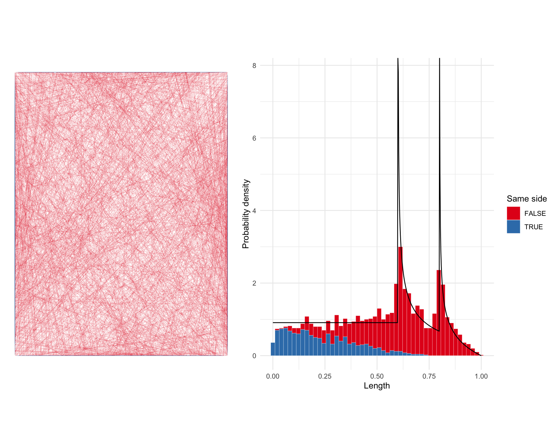
Looking at the results a bit more closely in this way, we realise that Horowitz’s result doesn’t take into consideration the question of whether lines enter and exit the space on two different sides, or put another way whether they are properly contained by the space.
Depending on the application this might be relevant or not, so it’s good to note this subtlety. It’s a topic developed further in a paper by Peter Taylor,4 which approaches the general problem through simulation.
It’s not difficult to replicate Taylor’s approach for any arbitrary shape with a few lines of code in R. As an illustration we can compare the distribution of line lengths contained within Aotearoa’s two largest islands.
nz <- st_read("nz-2193.gpkg")

north_island <- nz |>
  st_cast("POLYGON") |>
  arrange(desc(st_area(geom))) |>
  slice(2)

south_island <- nz |>
  st_cast("POLYGON") |>
  arrange(desc(st_area(geom))) |>
  slice(1)
We can then generate random points, and hence random lines between points on each island. We also tag the lines with whether or not they are contained within the bounds of the island.
ni_lines <-
  st_sample(north_island, 5000) |>
  get_lines_from_points() |>
  st_set_crs(st_crs(north_island))

ni_lines$contained <- st_within(ni_lines, north_island, sparse = FALSE) |>
  as.vector()

si_lines <-
  st_sample(south_island, 5000) |>
  get_lines_from_points() |>
  st_set_crs(st_crs(south_island))

si_lines$contained <- st_within(si_lines, south_island, sparse = FALSE) |>
  as.vector()

all_lines <- bind_rows(
  ni_lines |> mutate(island = "North Island"),
  si_lines |> mutate(island = "South Island")) |>
  mutate(length = length / 1000)
As before we can plot the associated length distributions.
ggplot(all_lines) +
  geom_histogram(
    aes(x = length, group = contained, fill = contained),
    colour = "white", lwd = 0.1, bins = 25) +
  scale_fill_brewer(palette = "Set1") +
  geom_line(data = prob, aes(x = d, y = p)) +
  xlab("Length") +
  ylab("Number of lines") +
  facet_wrap( ~ island) +
  theme_minimal()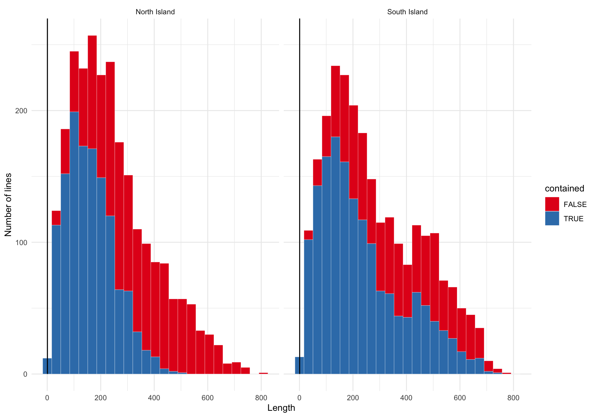
The difference between the North and South Island distributions is that the longest lines are much more likely to not be fully contained within the shape of the North Island. A map makes it clear why this is the case.
g5 <- ggplot() +
  geom_sf(data = ni_lines |> arrange(contained),
          aes(colour = contained), lwd = 0.2, alpha = 0.15) +
  scale_colour_brewer(palette = "Set1") +
  geom_sf(data = north_island, fill = NA) +
  guides(colour = "none") +
  theme_void()

g6 <- ggplot() +
  geom_sf(data = si_lines |> arrange(contained),
          aes(colour = contained), lwd = 0.2, alpha = 0.15) +
  scale_colour_brewer(palette = "Set1") +
  geom_sf(data = south_island, fill = NA) +
  guides(colour = "none") +
  theme_void()

g5 | g6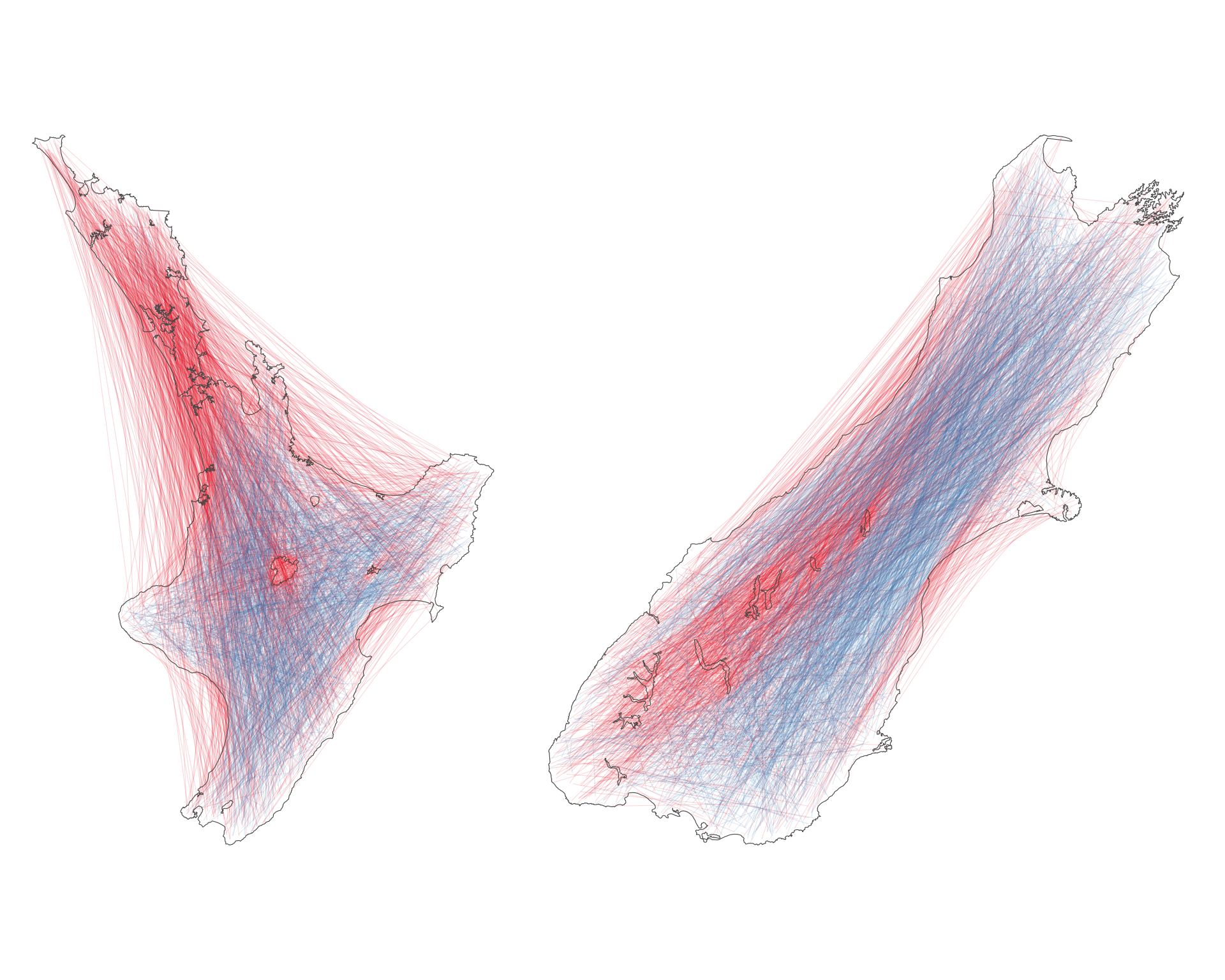
In effect the North Island is a lot less convex than the South Island and most of the longest potential lines between its farthest flung points are not wholly contained within the island.
The South Island is roughly rectangular, and its longest ‘diagonals’ can be contained within the bounds of the island. If you squint, you can even see the South Island distribution as somewhat aligning with Horowitz’s theoretical distribution for lines across a rectangle with width around 150km and length around 600km! Of course, since these data are not for lines crossing the island, but for lines within it the frequency of short lines is boosted substantially.5
Also worth noting is that the patch of red in the middle of the North Island is Lake Taupō, which stops a lot of the potential longest lines being fully contained within the island (if a line crosses a ‘hole’, then it’s not considered as ‘contained’). Most of the blocked long lines in the South Island are also blocked by lakes in this way.
This all might seem rather abstract, even a bit silly, but there is a point to it. In an analysis of distances (or for that matter any other metric related to spatial data) a significant constraint on the results is the spatial structure of the space in which the measurements are made. Another rather trivial example can be found in my post about the lengths of scheduled flights between off-by-one-letter airports. where the distribution of flight lengths is strongly affected by things like the extent of the Atlantic and Pacific Oceans.
The point is that spatial data are constrained by the shape of the space in which they exist. A lot of mathematical and statistical theory is developed on infinite uniform planes, which are not a luxury available most of the time when dealing with earth-bound spatial data. How interesting any particular observed metric is in a particular spatial context (is that line long? is it short?) is a function of that context, and so understanding things like the distributions of lengths in a space may often be an important first step in spatial analysis.
![]()
And those not yet written: I’ll try to keep the list updated↩︎
Page 169 in Horowitz M. 1965.Probability of random paths across elementary geometrical shapes. Journal of Applied Probability 2(1), 169–177. doi:10.2307/3211882.↩︎
There’s a minor issue with this approach which we’ll get to.↩︎
Taylor PJ. 1971. Distances within shapes: An introduction to a family of finite frequency distributions. Geografiska Annaler. Series B, Human Geography 53(1), 40–53. doi: 10.2307/490886↩︎
An interesting exercise might be to modify the code for either or both the rectangle and South Island cases to show equivalent crossing and within distributions.↩︎